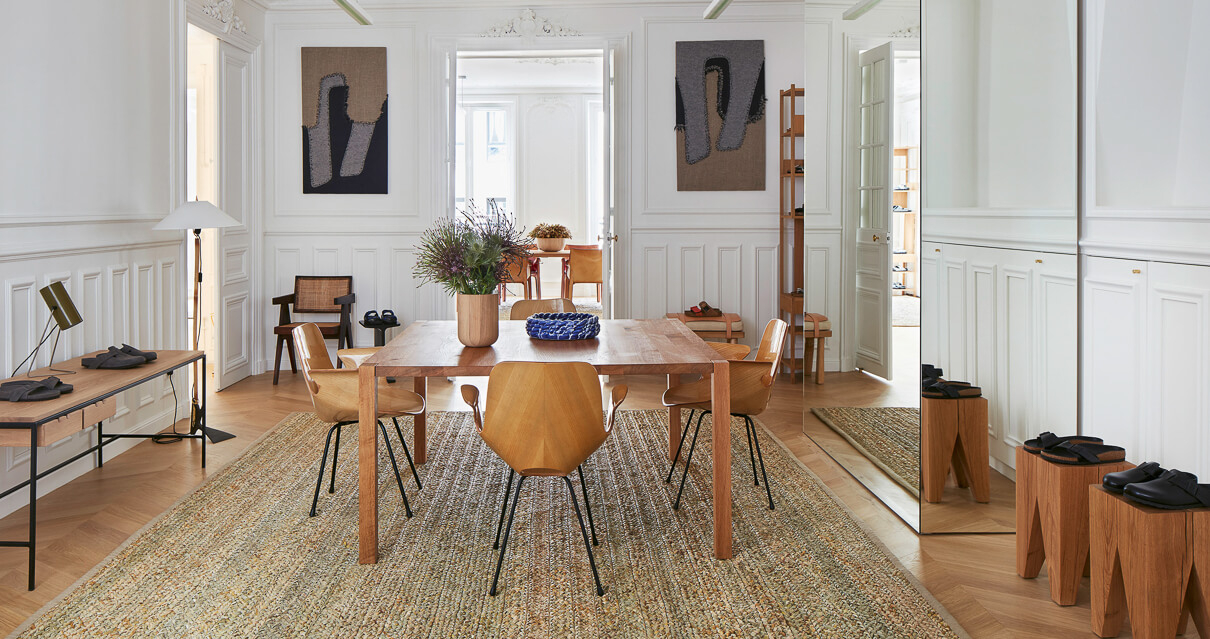
The Germans are now cool in Paris. Birkenstock has created the perfect space to showcase their iconic sandals.
A few years back, Birkenstock sandals were either relegated to the confines of your crib, or they were paired up with socks and strapped to the feet of German tourists. Today, things are a little different. A pair of Arizona’s is the go-to sandal of the moment. And somehow, somebody pulled a Jedi mind trick and we see the Boston been worn (without shame) with some funky socks. I know times change, but I still cringe.
Times, they have A-Changed
But with different context comes a different perspective. The Birkenstock brand is fully flexing in their newfound cool with their new showroom in the heart of Paris, aptly named Birkenstock 1774. Why 1794… cause it was the last time they were cool! Or when the company was founded. I forget.
Germans turn to the Brits to style a French flat… hmmm. Well.
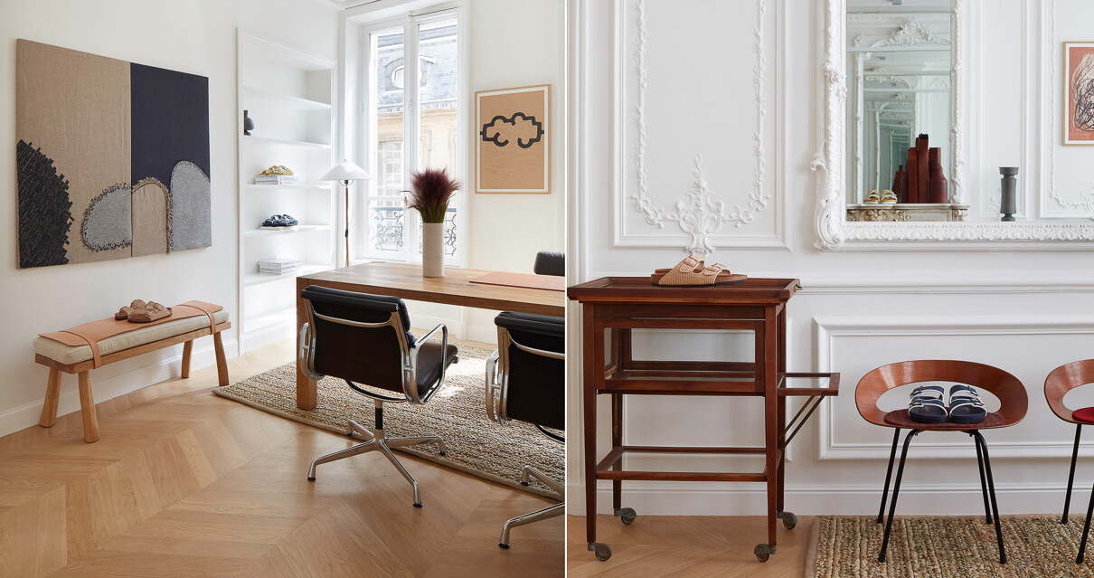
The Birkenstock bunch worked together with the London based design studio, Vinson & Co to create a space that exemplifies the brand’s core values.
Snide commentary aside, their core values are something we very much respect over here on Rope Dye. Quality, ethics, durability, longevity and we have to hand it to them, timeless style.
An ethos translated
The guys at Vinson & Co have done a damn fine job. They took what made the brand great and translated it into an interior space. The space itself is found amongst the high-end boutiques that line Paris’ Rue Saint Honoré. The living room vibe gives a cosy respite from the hustle and pomp of high fashion. It is just one of the ways that Birkenstock convey their values through a space.
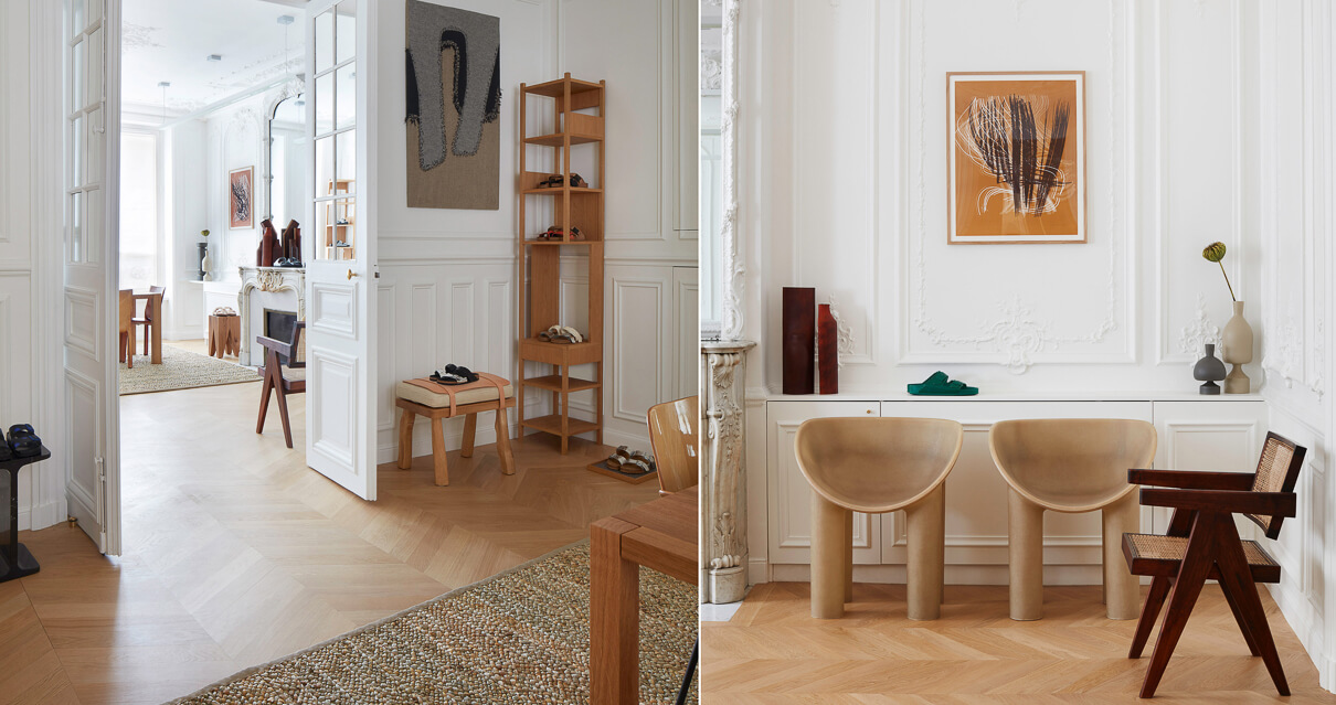
Leaving the “patina of age” on the ornate panelled walls, stone fireplaces and wooden parquet floors, the apartment’s interior reflects the way a pair of Birkenstocks grow more beautiful with age. Nick Vinson, founder of Vinson & Co then goes on to furnish the space with a combination of new and vintage furnishings that complete the story.
Uncluttered and organized… still a bit German then.
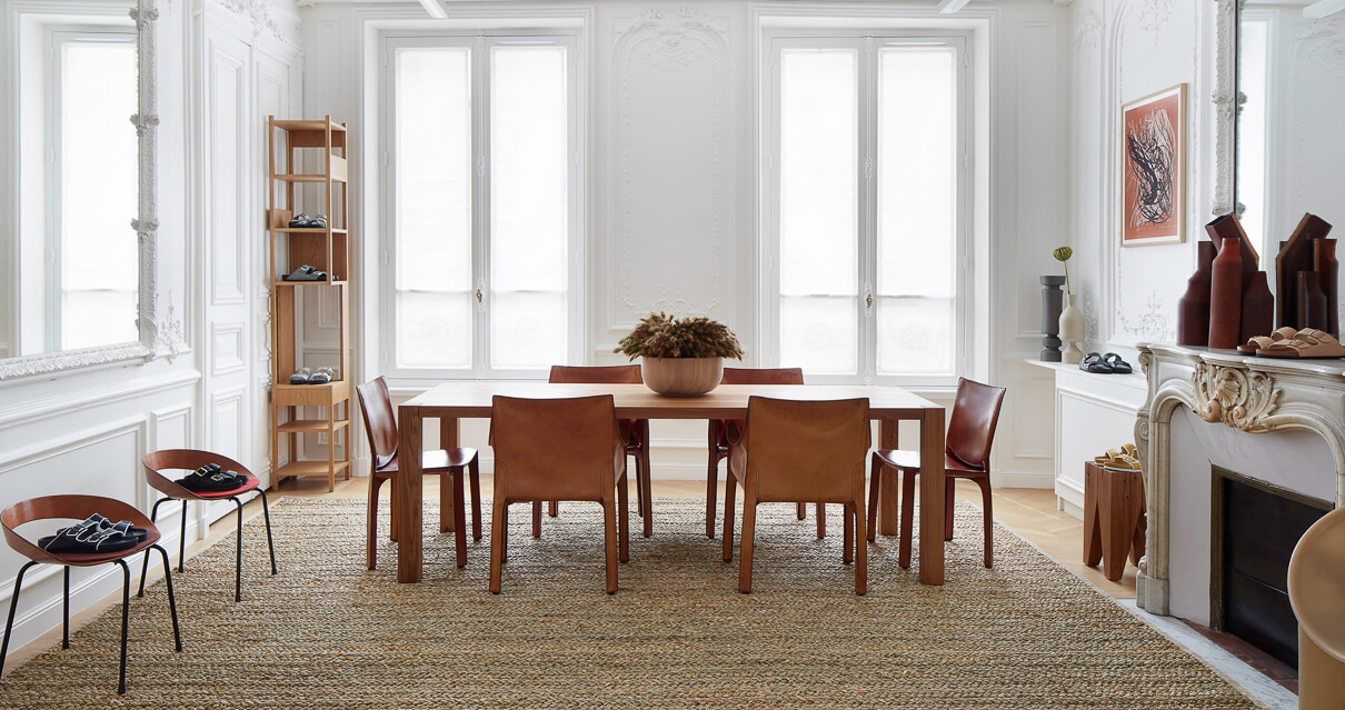
Looking at the pictures, we see the brands inclination towards unostentatious reflected in the fact that there ain’t too many actual sandals dotted about. They have fine examples of their models, but it is only a fraction of the whole collection. Anything more would spoil the intention of the showroom.
Big shout out to the amazing guys over at dezeen for bringing this to our attention and DePasquale + Maffini for the photographs.
