The intricate logo made up scripted lettering and their signature crossed pickaxes set the standard for many a denim brand, but with the new decade dawning, 3sixteen start things afresh with new brand identity.
For 15 years now, 3sixteen has been using the same primary script wordmark. Their elegant logo first becoming synonymous with contemporary high-end denim, then over the years, it accompanied the brand as it flourished into a fully-fledged menswear and lifestyle brand. All this time, 3sixteen have remained independently owned, carving out their own corner of the industry and staying true to their core values. Namely making the best clothes they can, with the best materials available in the best way possible.
The change-up.
But, times they are a-changin’. And while 3sixteen have always looked to the past to inform themselves in regards to quality, they have never been afraid to make changes for the better. So, as the 1st of January ushered in not only a new year but a new decade, 3sixteen have launched a new brand identity.
Pure practicality.

Part of the decision to change things up came down to pure practicality. The delicate scripted for just didn’t scale. When it was reduced to a certain size, it lost legibility. And speaking of legibility… that stylized 3 in 3sixteen, some of the time it was mistaken for a flourish. Imagine a new customer walking into Self Edge and asking for a pair of those Sixteen jeans… That’s just embarrassing for everybody!
The old logo and brand identity was an amalgamation of art, inspiration and necessity. In their own words:
Over the years, we collaborated with designers (amazing ones, to be sure) to try and put things together in a way that made sense to us; but what resulted was a piecemeal brand identity that was started by one, and built upon by others. In other words, we just did what we had to do.
Do it differently.

This time around they decided to do it differently. The spent a large chunk of 2019 working with Denver-based graphic design firm Studio Mast. While there was the temptation to simply rework the scripted logo and signature crossed pickaxes, they opted to start over from scratch. They would take into consideration all the influences and inspiration that have brought 3sixteen to where it is today and distil them into a brand new logo.
Letting go of the past.
An element of the branding that was near and dear to 3sixteen was the crossed pickaxes. Back in the days, the logo’s nod to the hard-working folks reflected this small, scrappy denim brand eeking out a place for themselves with dogged hard work, determination and humility. Over the years, however, this notion of crossing anything for a logo wore a bit thin.
We didn’t want our brand lumped into what felt like lazy and uninspired design after a certain point. The pickaxes meant something to us, but it meant something different to people who were encountering the brand for the first time. That’s why we felt that a change was in order.
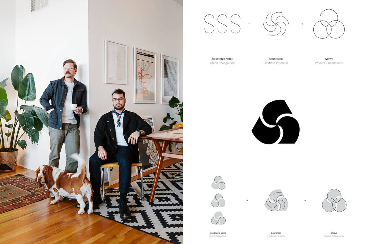
What the Studio Mast guys have come up with is a timeless representation of the brand’s values with subtle hints to the name “3sixteen itself. They drew on mid-century Swiss design, developing a chunky stylized graphic. Look closely (very closely), and you will see that it is made up of 3 interlocking letter “S’s”. 3sixteen, 3s, get it, got it, good. This interlocking “letter-play” represents the interlocked communities and relationships that have been essential to the brand’s success. The symbol works on a much more obvious level also, how many of you saw a propeller when you first saw it? Good, I am not the only one. To me, this means forward motion, speed and potential.
Change takes a little time.
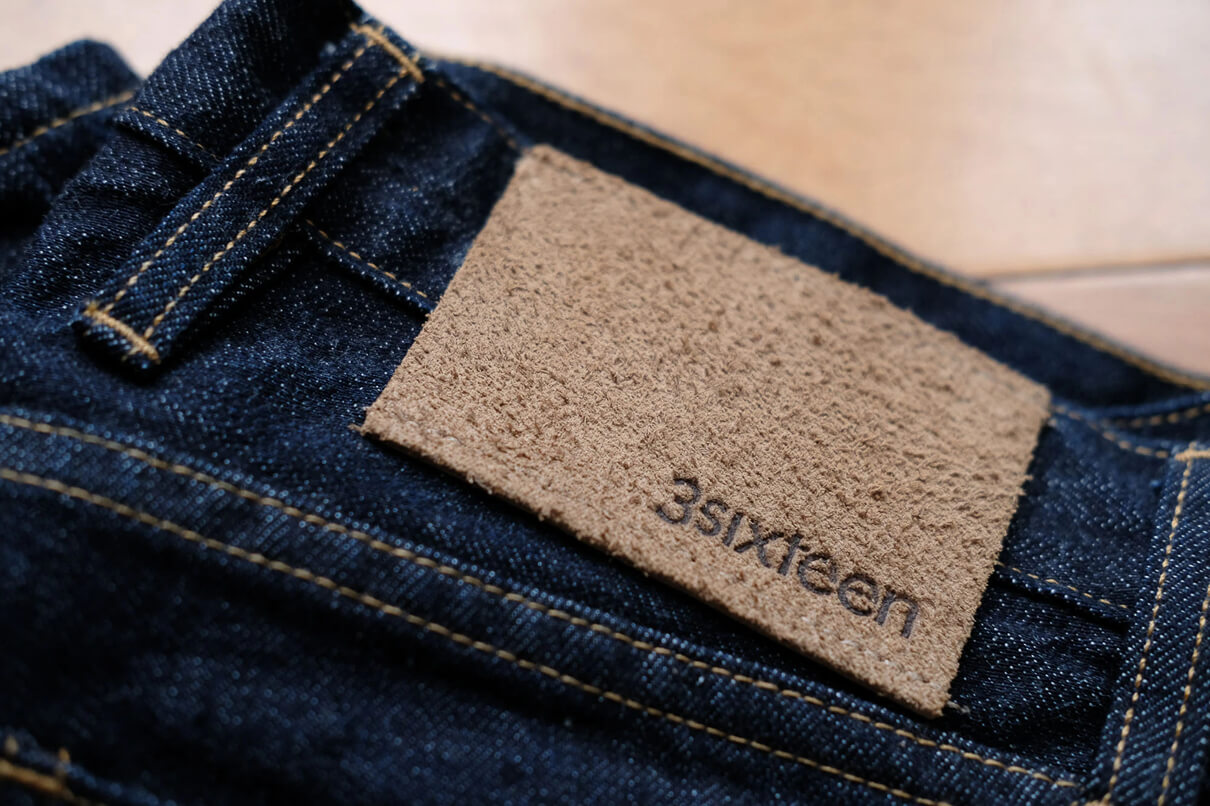
There will not be a hard cut in the product line up. There are simply too many garments out there sporting the old logo. The new logo will replace the old one organically over time. As stock in stores in depleted, new garments will be shipped with the new logo to replace them.
Looking forward to seeing where they are headed.
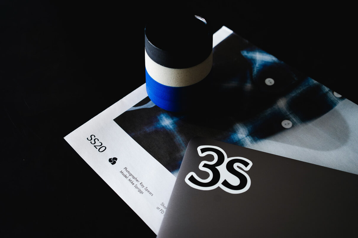
When the news of the rebrand first came across our desks, I’ll admit to having a little resistance. 3sixteen’s logo holds a lot of nostalgia. But nostalgia can hinder progress and 3sixteen has been smart enough at every turn to resist the temptation (and stagnation) of the status quo. This rebrand is no different. It will carry the brand into and (if they choose) through the new decade and I for one am very excited to see where it takes them.


